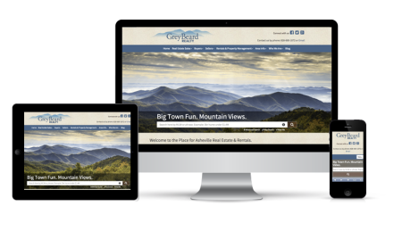
Responsive Websites Are Here!
To provide the best user experience on all of our websites regardless of the browsing device, we’re excited to announce the introduction of responsive websites.
Up to this point our platform automatically redirected a user to a mobile specific version of their site—a separate entity, distinct from the full site that is viewed on a desktop.
Our “Adaptive” Approach to Responsive
We’ve taken responsive design one step further and implemented adaptive responsive design. Adaptive content means your website is tailored to the type of device being used.
For example, you can hide content on your website’s smartphone version that is more relevant on desktop computers, and replace them with more effective mobile applications like geo-located listings and agent contact information.
What are the benefits of responsive design?
Consistent layout for the mobile device.
The mobile browsing trend for real estate shows no signs of slowing down. Over 50% of all online real estate traffic in August 2015 came from tablets and mobile devices, up from 40% in 2014.
Users are also spending more time on mobile devices than on any other Internet connected device—about 2.8 hours per day, according to a July 2015 digital marketing report.
Responsive design caters to the growth of mobile users—it ensures that the information, appearance, and functionality of the mobile website is just as effective as the full version. This way, your visitors will be able to navigate your site with ease and you will leave them with a favorable impression of your brand.
Responsive websites perform better on search engines.
We talked about it upon the arrival of mobilegeddon, and the same holds true today. Google favors websites that are mobile-friendly. A statement by Google’s John Mueller on August 18, 2015 reflects the ability of responsive design to cater to multiple devices:
“A good way to make it [a site] work in both worlds [mobile & desktop] would be to have a site that uses responsive web-design techniques to adjust to the size of the user’s device/settings.” — John Mueller, Google, Webmaster Trends Analyst
Google rarely discloses information about its preferences for search engine rankings, so when it does, digital marketers take notice. In a recent study Regalix, 61% of marketers are using responsive design as part of their SEO strategy.
Lead generation.
An easy-to-navigate layout means a high-quality viewing experience, which can only lead to greater engagement. The end result? More leads for your business.
After HubSpot shifted their website to a responsive layout, they found that their inbound leads increased by 66% immediately with an additional increase of 34% over an average of pre-responsive months. Their site-wide conversion rate increased from 2% to 5.6%, and usage from mobile devices increased from 11% to 15%.
Contact us below to learn more!

