Unbounce My Heart – How to Tune Up Your Landing Pages
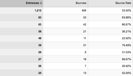
The key point to remember about a site’s bounce rate is that it’s not really about the site, it’s about each page. Often, a site’s home page bounce rate is perfectly acceptable and by that I look at anything under 30% to be healthy.
When looking at your Analytics data, it’s important to look for pages that are causing visitors to bounce i.e. leave immediately and look for ways to tune them up so they support the rest of the site.
Using Your Top Landing Pages Report
 You’re going to need to take a look at the top landing pages report in Analytics. It’s your most highly trafficked pages that are going to need to close the deal, so if any of them are leaking traffic, then they need patching.
As I mentioned, anything above 30% deserves a closer look. So ask yourself the following questions about that page:
- Is it clear what the visitor can do next?
- Does the page content reflect the intent of the search query?
- Is there a call to action and explanation of benefits?
- Is the message of the copy clear?
- Does the page offer any item of value like a white paper or coupon?
- Is there an emotive or engaging headline?
- Is there a consistency in the design elements with the rest of the site and sense of trust?
- Is the most important content above the fold to grab attention?
- Are click-able links clearly click-able?
- Does the page have any images, videos or graphics?
Cull Your Weaker Pages
Not every page is going to be able to tick all these boxes since some content will be more straight-forward than say a special offer landing page. It might also be the case that if a page is weak, just remove it. Keep your site at a good fighting weight, search engines are looking for a strong full page of content as opposed to skinny pages. Moreover, you are less likely to attract links with a few lines on a subject.
Example of a Good Landing Page
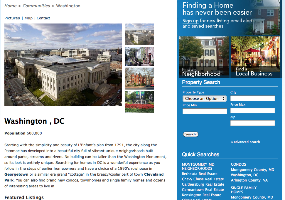
Here I have chosen a client’s real estate to indicate a few things I like.
 http://www.homesandadvice.com[/caption%5D
What I Like
- Simple layout: The 2-column provides a clean distinction between persistent areas of the site and the main content. If Washington D.C is not my bag or I want to go deeper into the site, I don’t have to hit the back button or feel like I need to go to the home page and start again.
- Use of Images: Beautiful images cannot be over-stressed. This site is selling real estate and so must ‘sell’ the area and having a few different images in a handy viewer keeps me engaged.
- Attention Grabbing Calls to Action: Over on the right hand side there are visually appealing and active voice calls to action. Also there are more simple but clear CTAs that efficiently explain what I can do.
- Clear Navigation: The use of breadcrumbs, in-text links and sidebar links reduce confusion and ‘don’t have to make me think’.
There are spots where this page can be tweaked for effectiveness, but that’s how it should be. A website is always a work in progress and needs to adapt to evolving visitor behavior.
Still want more?
Check my previous post on writing good landing pages.
Good luck tuning up your landing pages and feel free to leave a comment!

Pingback: Easy Way to Avoid Thin and Poor Quality Content | Panda Upodate